
Technical accuracy is necessary but not sufficient
A technical company may spend months checking that every specification, mechanism and diagram is correct. This is necessary. It does not automatically make the website useful.
The buyer still has to answer a different set of questions: Is this relevant to my problem? What changes if I use it? What evidence supports the claim? What would adoption require? If the website provides accurate information without helping the reader answer those questions, it behaves like a well-organised technical folder rather than a decision tool.
Good technical website content does not remove depth. It decides when each layer of depth becomes useful.
The website begins where the internal conversation ends
Inside a technical company, teams share years of context. Product names, methods and abbreviations feel self-explanatory. A new visitor does not have this context.
Imagine entering a laboratory meeting after the team has already discussed the problem for six months. If the presentation begins with “the revised configuration improved the result,” you first need to know the original configuration, the result being measured and why the difference matters. A website visitor has the same problem when the homepage begins with an internal product description.
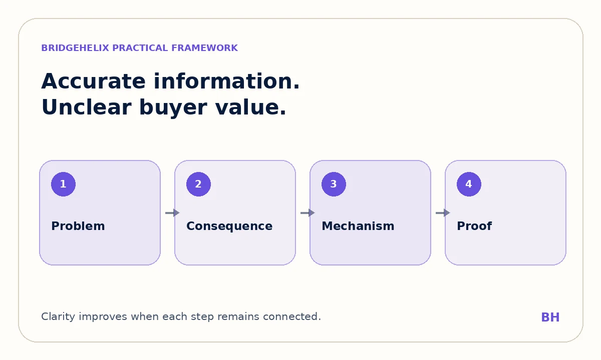
A clearer page starts one step earlier. It identifies the problem, the organisation affected and the practical consequence. The mechanism then has a reason to be read.
Features appear before their decision value
A material may have a particular surface structure. A platform may use a distinct workflow. Equipment may contain a proprietary design. These features become persuasive only when the reader can see the performance, reliability, safety or operating question they influence.
The solution is not to replace every feature with a benefit slogan. That can create a second problem: marketing language that sounds simple but cannot be defended. The feature, consequence and evidence should remain connected.
For example, a wider operating pH range is a technical feature. Its practical meaning may be that treatment remains effective across more variable feed conditions. The proof still needs the tested range, comparison and relevant performance result.
Evidence has volume but no hierarchy
Technical websites often include many numbers, papers, certifications, diagrams and partner logos. More proof does not automatically create more trust. If the reader cannot tell which claim the evidence supports, the page becomes a document archive.
Strong hierarchy introduces the central value, presents the most relevant proof and gives the conditions or deeper source nearby. This allows the reader to understand and verify instead of simply admiring the amount of information.
A certification should be connected to what it certifies. A test result should state the material, conditions and comparison. A case study should identify the baseline and outcome. The hierarchy gives every proof item a job.
One page tries to serve every reader
A single page may attempt to explain the company, technology, applications, industries, research, commercial model and contact process. The result is often long but incomplete because each subject receives only a fragment.
A better architecture gives pages distinct responsibilities. The homepage establishes positioning and helps visitors choose a route. Service or solution pages explain the offer. Industry pages show context. Articles answer deeper questions. Case studies provide application evidence. Internal links allow the visitor to choose the required depth.
This is why the homepage should not contain every technical detail. It should make the website understandable enough that the reader knows where to go next. Our homepage messaging framework shows how that sequence can work for science and engineering companies.
The company describes itself instead of the buyer's decision
Many headings begin with “we are,” “our platform” or “our innovative approach.” The organisation is speaking accurately about itself, but the reader must translate those statements into relevance.
A buyer-centred page does not avoid the company. It frames the company through the decision the buyer is making. The page may explain the operating problem, the consequence of leaving it unresolved, the approach used and the evidence a technical team can review.
This is not a change from technical to emotional copy. It is a change from internal description to decision context.
Claims are vague because the evidence has not been mapped
Words such as sustainable, efficient, advanced and scalable often appear when the team has not decided which measurable difference should lead the message. The writer then fills the gap with adjectives.
The better process is to map the claim before polishing the sentence. What is being compared? Which measure changes? Under what conditions? Is the evidence from simulation, laboratory testing, pilot operation or commercial use? Which limitation would a careful buyer ask about?
Once these questions are answered, the copy normally becomes clearer without needing louder language. The technical value proposition guide provides a practical method for making that connection.
The call to action asks for too much too early
A first-time visitor may not be ready to book a sales meeting. If every page offers only that action, the site ignores the work required to create trust.
The next step should match the page. An educational article may lead to a related guide or service explanation. A technical page may offer a data sheet, evidence discussion or application review. A service page can invite a scoped conversation because the visitor now understands what would be discussed.
“Contact us” is not always wrong. It is simply incomplete when the reader does not know what will happen after clicking.
Visual design cannot repair an unclear sequence
A new layout can improve readability, hierarchy and credibility. It can also make an unclear message look more polished. If the audience, problem and value are still missing, the visitor experiences the same confusion inside a better interface.
Message and design should therefore be developed together but evaluated separately. First check whether the page tells a coherent story. Then use typography, spacing, imagery and interaction to make that story easier to follow.
Repair the system, not only the headline
Begin by identifying the primary audience and decision for each important page. Map the current claims to evidence. Remove duplicated page jobs. Decide which information belongs at the first layer and which belongs deeper. Finally, choose a next step proportionate to the trust the page has earned.
A technically strong website should allow a non-specialist buyer to understand why the technology matters and a specialist to verify why the explanation is credible. When both can do that without guessing, technical accuracy has become useful communication.

About the author
Dr. Prakash Kumar Singh
Founder & Technical Content Strategist
PhD in Chemical Engineering from MNIT Jaipur, with M.Tech and B.Tech qualifications in Biotechnology. His work connects technical evidence with clear B2B communication and ethical research support.